New CI & Membership Redesign
Redesigning the app to make the new program and brand experience clear, modern, and engaging

On This Page
To align with The 1’s new corporate identity (CI) and revamped membership program, the app was redesigned to reflect a modern, friendly look while solving key UX issues in the existing experience.
The goal was to elevate the brand perception, improve usability, and design an experience that educates users about the new tier system and keeps them engaged throughout their journey.
Main design challenge
Help users understand how the new membership program works.
Encourage them to spend more and keep engaging with the app.
Because of limited time, we focused on the most important element that affects the whole app, "the card design". Cards appear almost everywhere, so if we could improve them, we could also improve the overall look and feel.
Goals for card redesign
Show less but clearer information
Make each card type easy to recognize
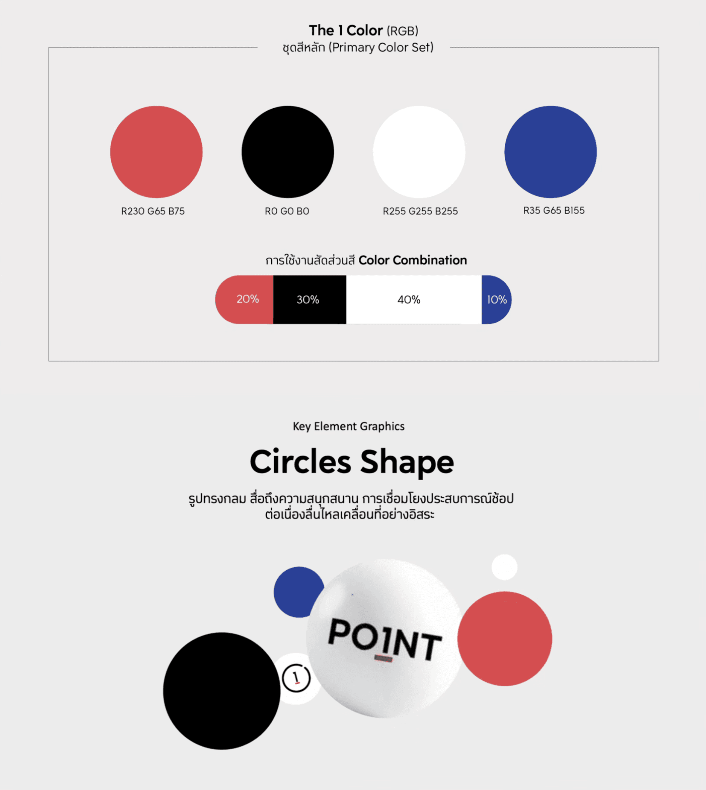
Apply the new CI style
Create a design that’s scalable and easy to maintain in the future
Visual exploration
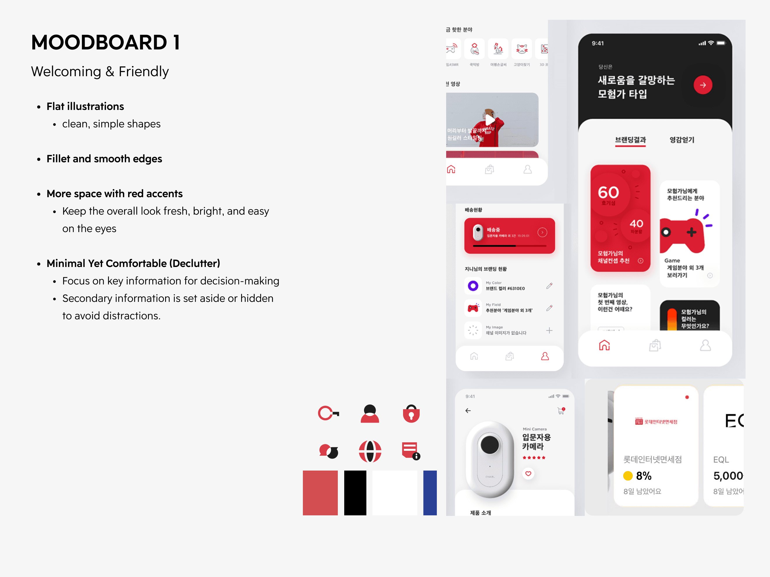
I created moodboards and direction options to test how the new CI could look inside the app.
Card Redesign
Information Architecture
We restructured the content and hierarchy so users could focus on what matters most.
I also created generic card rules and component principles to support future item types.
End-to-End Experience Design
To help users understand the new membership program and updated CI, we rethought the end-to-end experience across all membership levels, from entry level (The 1) up to The 1 Exclusive, the highest tier. The design needed to communicate progress, benefits, and motivation clearly at every step.
Main Navigation
We defined four main navigation areas that represent the key touchpoints of the membership journey. Each section dynamically changes based on the user’s level
This structure helps users clearly see their growth path and motivates them to reach higher levels through a consistent, guided experience.
Design Direction Exploration
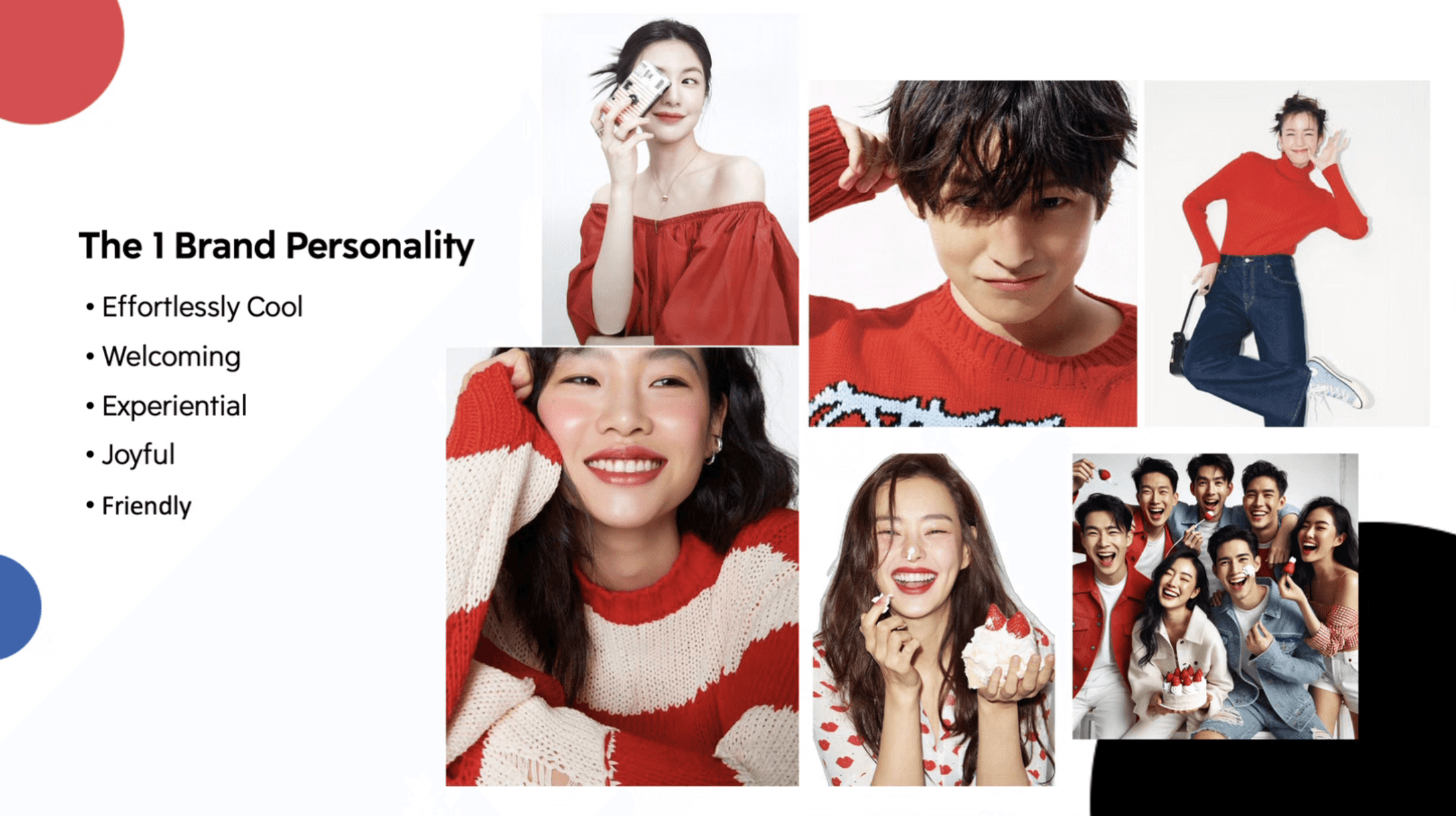
After creating the moodboard, we explored several design directions and presented them to stakeholders to find the style that best fits the new brand CI
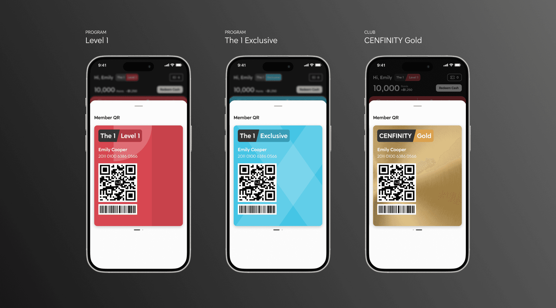
Visual Card Design
We designed the new membership and QR cards to visually represent user status while keeping the look consistent with the new CI. The design uses color, typography, and layout to communicate each level from basic members to The 1 Exclusive.

At this stage, we brought everything together into the final design. Each screen was created to help users understand their membership level, discover benefits, and stay motivated throughout their journey.
Final Design
We delivered the end-to-end experience screens covering these main scenarios
Onboarding
Learn the new program
A short tutorial that introduces the new CI and explains how the new membership program works.

Home Page
See your benefits clearly
Shows personalized information based on each user level

Membership Benefit
Track your level progress
Displays all membership levels and benefits in one place. Users can see their current level, what they’ve already achieved, and what’s coming next, including access to different clubs

Member QR Card
Collect points and show your membership identity
Designed for quick and easy point collection during purchases