Gamification
Enhance the shopping experience through Gamification and Extra benefits

On This Page
Overview
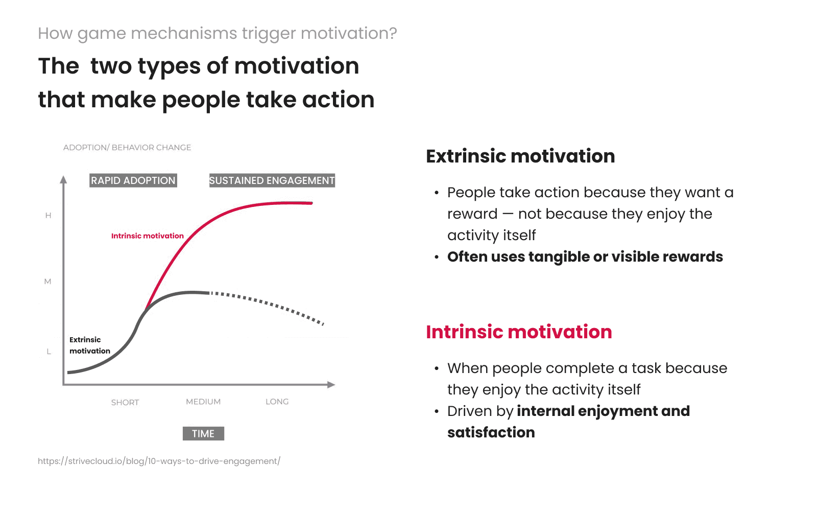
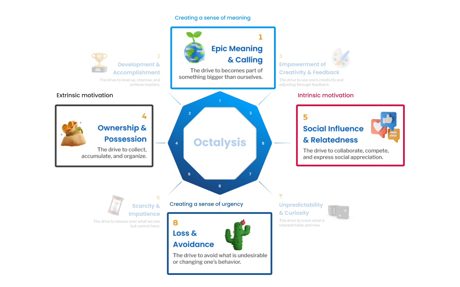
To make shopping more exciting and rewarding, The 1 launched a Challenge Feature, a new way for users to earn extra points and exclusive discounts through fun tasks. This feature is designed using gamification, turning everyday shopping into a game with goals and rewards, and create a habit loop that brings them back to the app more often.
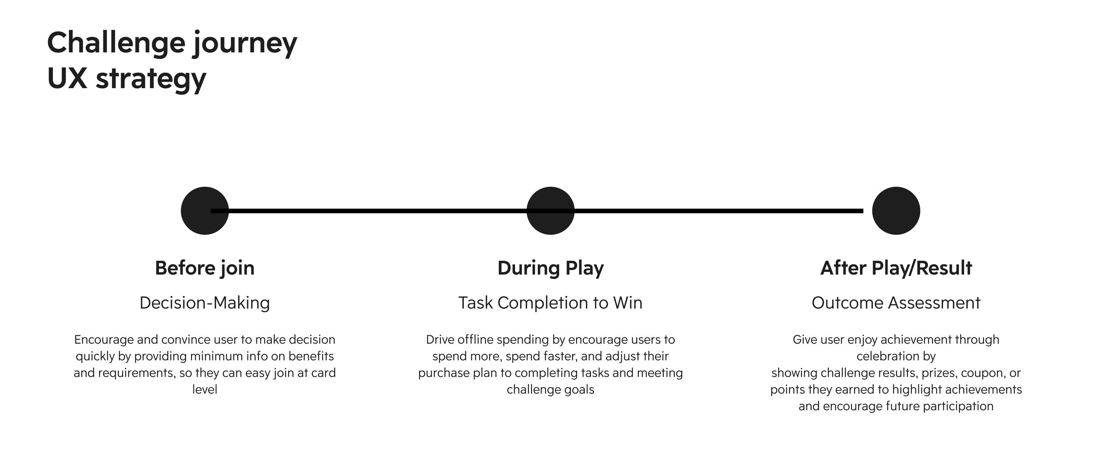
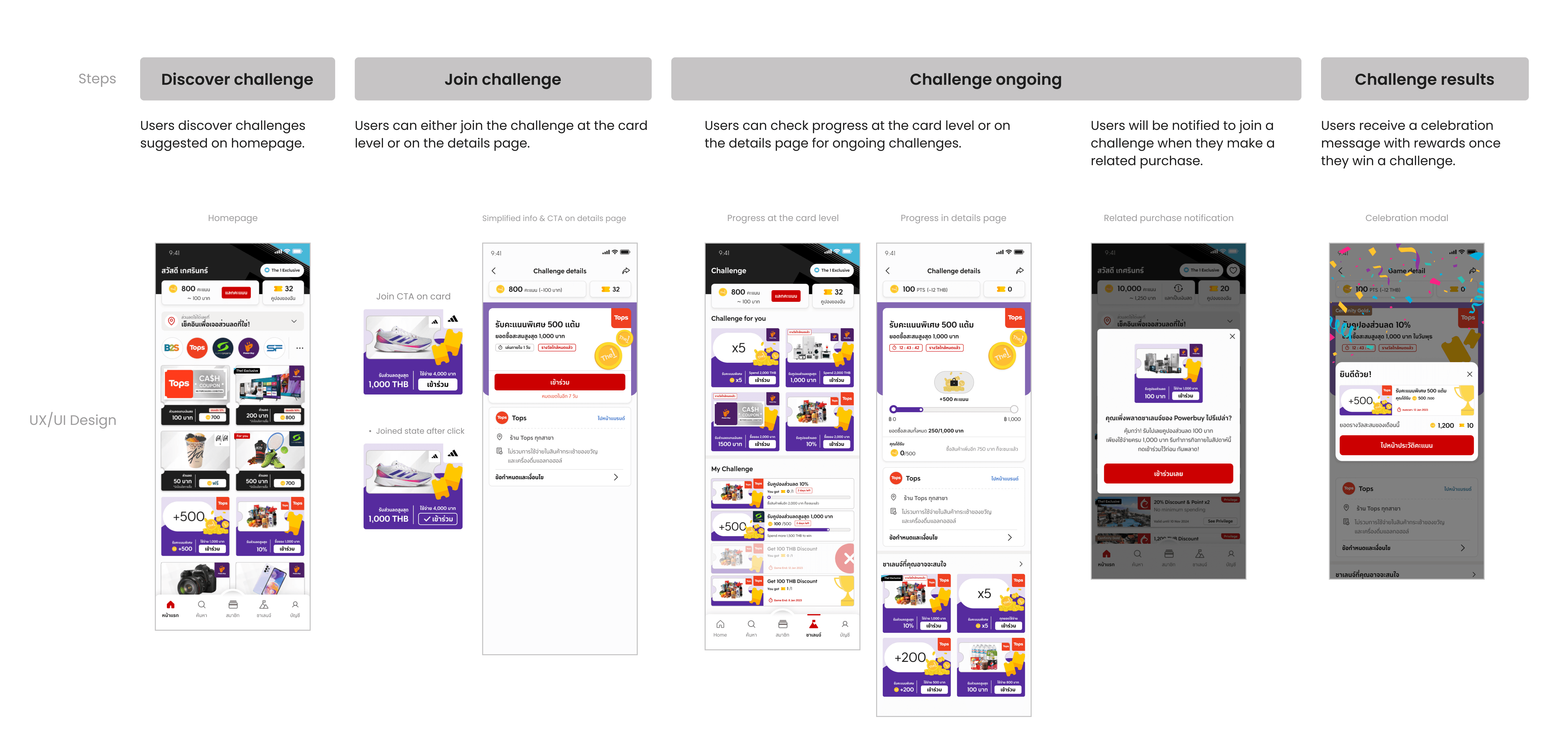
User Journey & Feature Lifecycle
After research, we split the journey into four phases and applied what we got from research to each one.

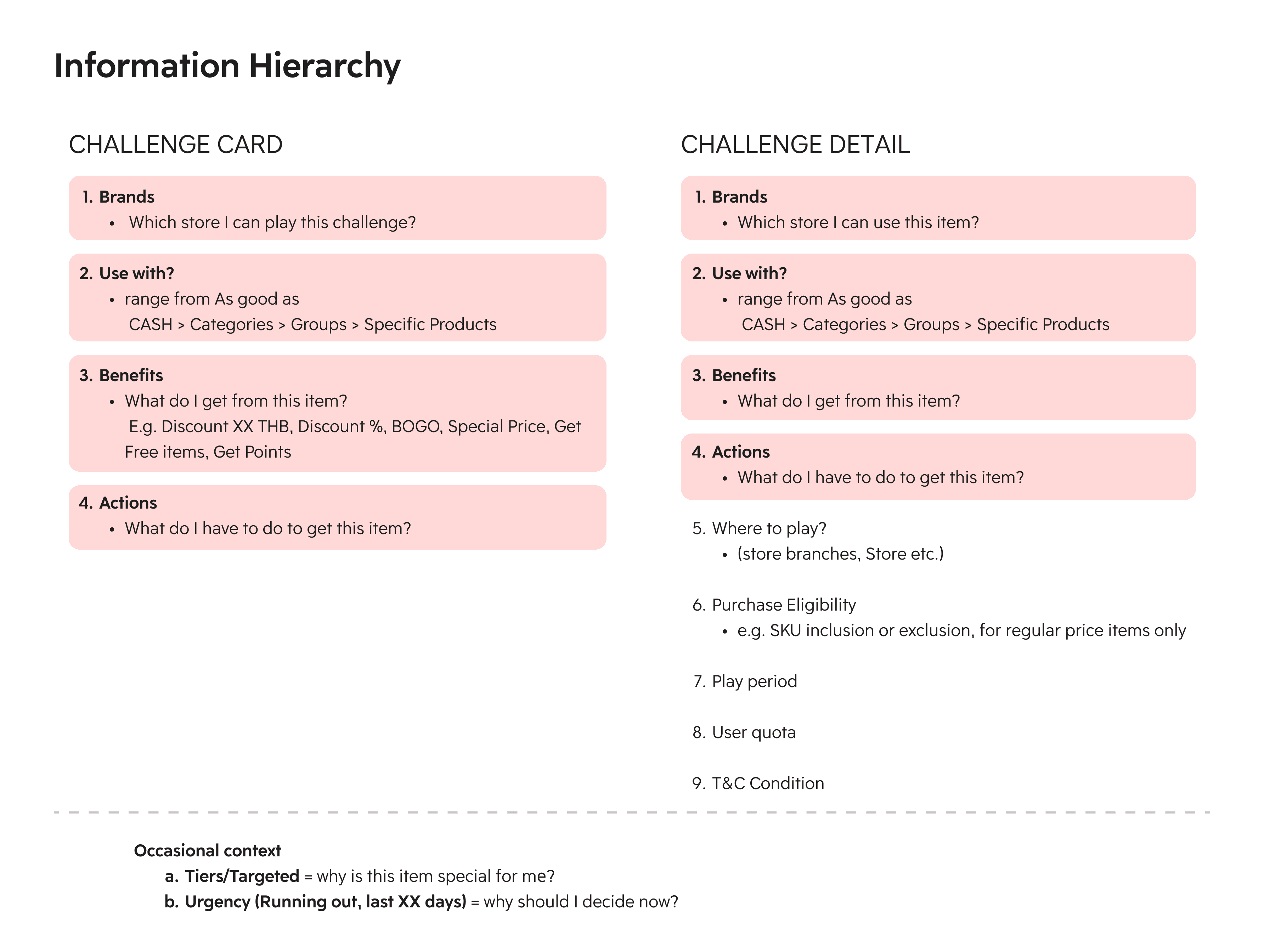
Information Architecture (IA)
We looked at the app’s navigation to see if we really needed a separate “Challenge” Navigation. This new navigation helps keep all challenge activities in one place. By updating the IA, we can organize important details like earned benefits and user avatars so that users stay engaged and motivated over time.

Controlled vocabulary (Terminology)
Create a clear, consistent set of terms for all elements within the "Challenge" feature
Clarity: Ensure users understand what “Challenge” means and what to expect when they tap on it.
Priority Information: Highlight the most important details, placed above the fold, so users can quickly make decisions and interact with the feature

Design
We designed this flow to make challenges feel easy and rewarding.
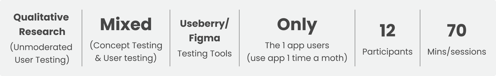
User Testing
Research Objectives:
To validate users' understanding of UX concept design related to gamification.
To gather feedback and assess the desirability of the gamification (Challenge) features in The 1 app.
Example Questions:
[Task] Imagine you are looking for a 'challenge' that rewards you a discount coupon. Click the correct answer card.
[Desirability] "I see myself using this feature if it becomes available in The 1 app." Please rate this statement from 1 to 5 (1 = Totally disagree and 5 = Totally agree.)
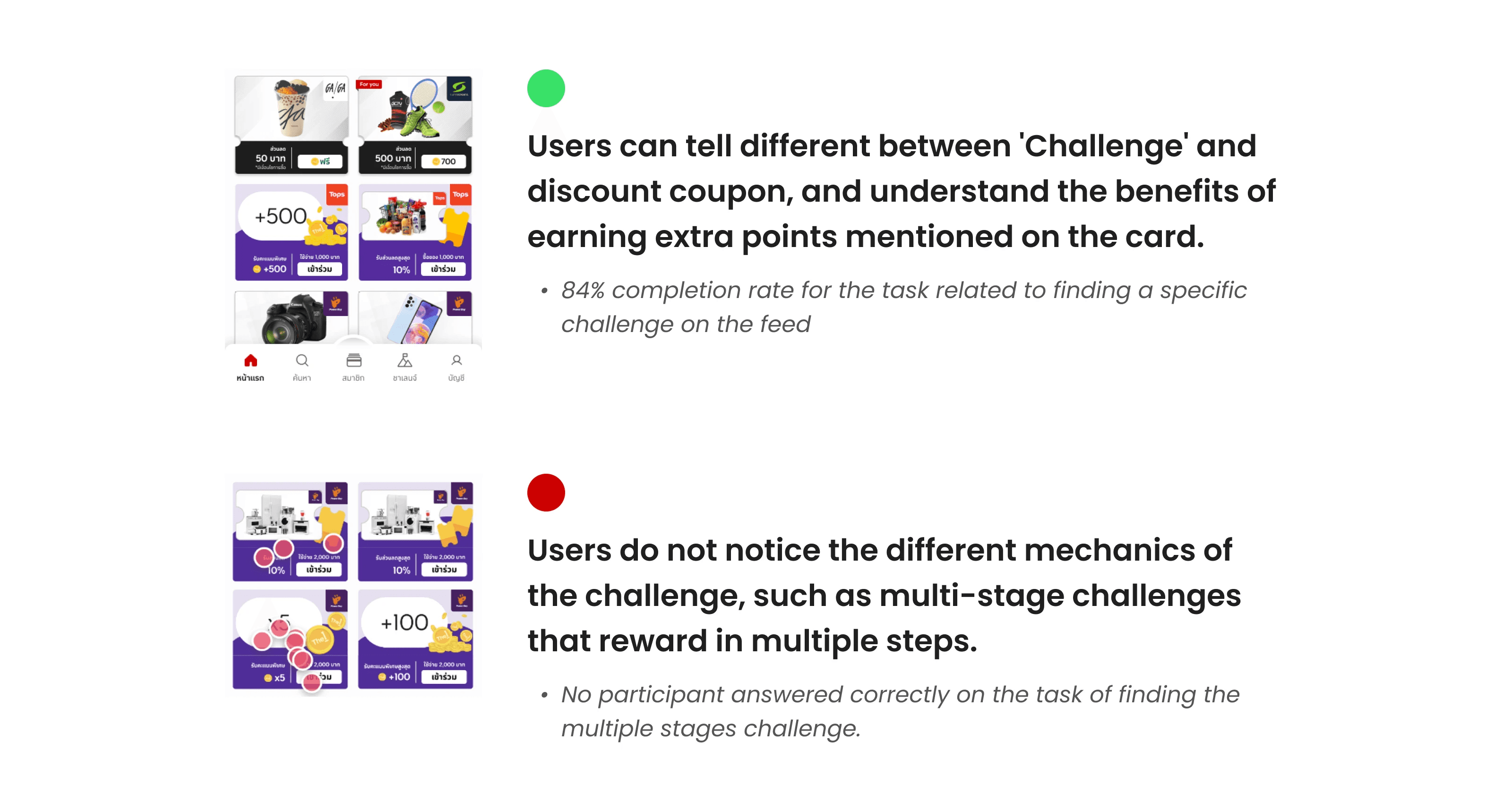
Key Takeaway
Testing showed the card had too much info, so we went back and simplified the card.
We trimmed it to the must-know and put all other rules on the details page.
Design Iteration
After usability testing, we simplified the Challenge card and details screen. We aligned the layout , reused shared components from Coupon/Cash Coupon for consistency, and removed nice-to-have items that slowed development. These changes kept the solution feasible and helped us launch on time for the May 2024 campaign.
Motion & Micro-interactions
I created animations and micro-interaction feedback using Figma Prototype and Adobe After Effects, then exported them as Lottie JSON files. These animations were designed to enhance engagement and give users clear, delightful feedback throughout the gamified experience.

Design Handoff
App Flow
I created a detailed app flow diagram that visualized every possible user path
Motion Sequence Guides
I also prepared detailed animation handoff files and motion sequences to guide developers, ensuring that each transition and interaction followed the intended design and timing.
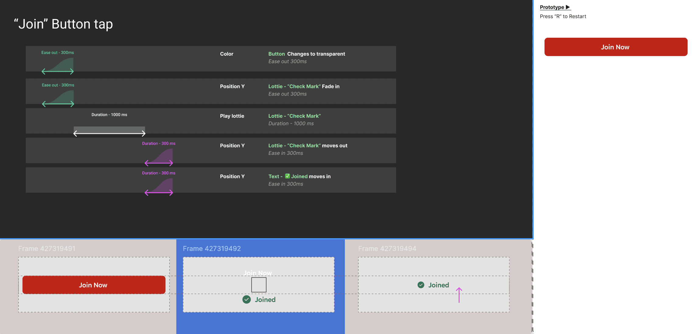
Example of animation handoff for developers
How users discover the challenge
Can find in 8 places :
Home , Hub, Search, My challenge, Coupon detail, My coupon, Used coupon, Spending Insight.
If the card already looks good, tap it to Join right away. If you want more info, open the detail page and Join there.
Celebrate every purchase
After each purchase, the app gives positive feedback and progress bars, create a sense of achievement and motivation to complete challenges. App will send a notification that deep‑links to the challenge detail. On the detail screen, progress animates so users feel their step forward
Result (Win/Lose)
When you complete a challenge, we celebrate with a joyful screen. The detail page also shows the completed progress and a prize box.


